When reviewing dozens or hundreds of applicants at once, don't you want to know how each individual stacks up relative to their peers? Now you will, with Huminology's Quintile Performance Charts, which neatly display how candidates stack up against each other on core competencies, all with a quick glance at the performance chart.
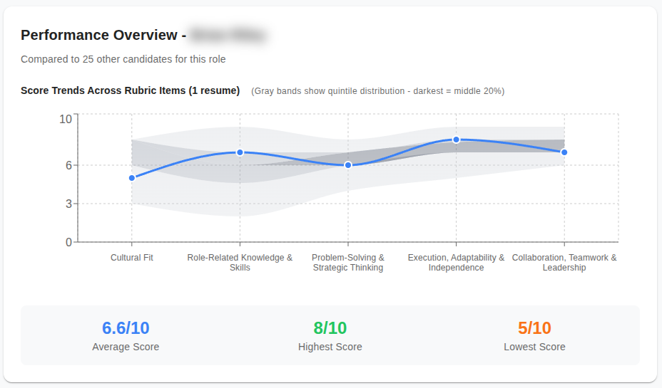
As more candidates go through the interview process, keeping track of how each one compares across various evaluation criteria can become challenging. Our candidate performance charts have been enhanced to include quintile breakdowns. This visualization provides an intuitive cue of where a candidate ranks within the distribution of their peers. This makes it easier for recruiters to quickly assess and compare candidate performance across multiple metrics.
How does it work?
With each new resume added or interview completed, candidate statistics are updated in real time. Performance chart not only shows the candidate's scores but also displays each quintile of the cohort in a different shade of gray. You can find the performance chart on every Interview Scorecard and every Resume Scorecard.
This feature is part of Huminology’s commitment to providing actionable data-driven insights in candidate evaluations. By visualizing rankings in this manner, recruiters can make informed decisions without sifting through data manually. Recruiters and hiring managers gain a more structured and immediate understanding of candidate rankings, streamlining the decision-making process and enhancing the overall efficiency of candidate assessment.